Wednesday, March 29, 2017

Spring-y card #2

This card was made using Art Impressions (AI) watercolor stamps with Tombow Dual Brush markers on Fabriano Studio cold press watercolor paper.  I used the AI covered bridge, flower, foliage and tree sets.  I've got to admit that I did make a few attempts.  AI is great to provide color, paper and even video suggestions/information for their stamps. But my waterbrush markers are Tombow and they didn't match well with my initial paper choices.  Of my paper stash, they worked fabulously with the Fabriano paper.  If you're having difficulty with any technique or medium choice, I suggest you try using different paper.  It's amazing the different outcomes with just that slight change.  And of course that additional practice can only help you in the long run!

I also used the largest of Lawn Fawns small dotted rectangle stackable to cut out the piece before mounting to a periwinkle A2 card base. 

This is the final day for Art Impressions Spring-y challenge.  Check it out!  And in case you're wondering, YES so far I've managed to do a little color each day so far this month, my personal challenge for the 30 day coloring challenge!

Do have a good week!

Sunday, March 26, 2017

Yoo-hoo, more Enyshou?

More of this week's comfort tangle, Enyshou.  Here as a background for my 30 days of coloring project.  The stamp is from Delicate Florals By Penny Black and stamped with Memento ink.  I used Polychromos to color the image and then used Memento gray and blues sponged on for the background.  I used a Uniball Signo angelic white pen to tangle Enyshou over the ink background.  The white pen picked up some of the dye from the ink here and there and has a really nice blended effect (a happy accident).  I also used the stamp to accent the card interior and its envelope.  The background is subtle and hard to show in a photograph, but you can see it a little easier from the side.  This is also inspired by the Diva's weekly challenge.  If you missed this week, check it out here.

One night after going to bed, I realized I hadn't tangled any that day and since world events had me a little stressed, I picked up a tile and started drawing in bed. Yes, propped up against a pillow, sitting with the tile in my lap using the Zentangle kit box as my table.  I did the black ink that night (Pigma micron) and the gray ink (Graphik) I did the next day with the graphite background.  I wanted to try the white gel pen on top of the graphite, but it just wasn't showing up so I sat it aside for the day.  The next day I picked up a metallic silver Gelly Roll and was quite happy with that.  The graphite shading came next. Sometimes a tile comes together all at once, sometimes it needs to be coaxed.  Again, the silver is hard to see in a photograph, but from an angle, you catch a glimpse.  

Perhaps I'm relaxed enough to handle next week?  We'll see.  I hope you have a good week!

Wednesday, March 22, 2017

Enyshou, today's MacNCheese

The Diva Challenge this week is to use your MacNCheese tangle, or comfort tangle.  Mine can vary from time to time, however I always get lost in Enyshou, even on a small Bijou tile (approximately 2 inches square).  Today, in keeping with the 30 days of coloring challenge, I did mine in Rose Pigma micron and shaded with a CretaColor watercolor pencil.  If you're viewing this from the card-making/coloring world, be sure to check out the Zentangle® world over at the Diva challenge, and if your a tangle fan, be sure to check out the coloring examples.  I think you'll find they blend, hilight, compliment and contrast each other well just like any fascinating art piece!

Monday, March 20, 2017

Crescent Moon 3Z

Inspired by Rick and Maria's kitchen table tangles videos (available on the Zentangle® Mosaic app) and my new set of Sakura PNs I decided to tangle on a pre strung 3Z I had thanks to a friend of mine (thanks Deana!)

I got the set of 8 PNs that I found on Amazon.  I believe they have the same ink as the microns.  According to the package, they have a "Durable, flexible nib for fine to medium line widths.  Archival ink is water proof, chemical and fade resistant, bleed free, quick drying and ph neutral."  The package says .45 mm. I found the list of colors when I went to the web site....black, red, blue/black (I love this one), blue, rose, burgundy (I thought it was brown, but nope, burgundy! Very nice!), purple and sepia (which is actually a very dark brown).  The web-site also clarifies that you can obtain  fine or medium line width depending on your personal writing pressure (0.4mm - 0.5mm). This equates roughly to the 05 Pigma micron which is listed as being 0.45mm.

As you can tell from my 3Z of Crescent moon, you can get a very fine line with a light touch.  Each side of the triangle is approximately 3.5 inches long.

I used the rose, and both blue and blue/black.  In comparison, I also used a graphite (that's the color) Graphik 0.1 line maker by Derwent.  It is a lightfast pigment ink and I love that the color mimics pencil but you don't worry about smudging.  To compare line widths, check out the gray in the center of each corner (I used the PN in blue/black and Graphik in graphite in all three corners.  Instead of graphite pencil shading, I opted for Polychromos colored pencils.  

And in case you missed my post about those magnolias, they were created with watercolor pencils and a stamp set from Altenew.  You can find my post here.

Magnolias for her

I've been trying a little more no-line coloring with this beautiful stamp set, Magnolias for Her from Altenew.  I stamped onto a watercolor block by Winsor & Newton Cotman, cold pressed using tattered rose distress ink by Ranger.  Initially I planned to trim down the piece to fit an A2 card base.

I'm still participating in the 30 day coloring challenge.  Even though it's not a requirement to color each day, I've managed to do just that, so far this month.  I lost track however of how many days I worked on this project.  Perhaps 4 days?  I believe this early picture was my progress the first day, pretty tentative with my color.  I actually used water with my CretaColor Aqua monolith pencils (I've been using them dry lately, they are so creamy and blend nicely). 

At this stage, I was really happy with the result, it put a smile on my face!

I drew in branches with a sepia Sakura Pigma micron and added some background color.

And the full final version.  I'm so happy with it that I can't bear to trim it down....I spaced the blooms too far apart for an A2 card.  It may be a keeper.  Or I may make a larger card than usual...

Friday, March 17, 2017

Happy St Paddy's Day

Just a little fun for the day.  A shamrock Waybop or shamWAYrockBOP! Skwim also showed up along with Fescu and Flux.

Thursday, March 16, 2017

Coloring the cutest little owls!

Two more days of the 30 days of coloring challenge to make this card.  The "Five Whoots" stamp is by Art Impressions.  I tackled it with Copic markers with a touch of Gelly roll white pen on the eyes.  On the following day I stamped the background using a Lawn Fawn stamp set Gingham Backdrops with persimmon Versa Magic chalk ink.  I had no reason for chalk ink, just trying to match a color from my ink supplies.  I had tried to use my same Copic markers and spritz colorless blender before stamping, but I just couldn't make it work.  And I die cut the slider window which is also from Art Impressions.  I cut the Owls into a cute little bookmark.  Because Copic bleeds through to the back of your paper I doubled up the cardstock on the bookmark.  Even double thickness, it slid just fine. Behind the bookmark I stamped the candles and sentiment both by Penny Black.  When I try a similar card in the future, I'll try to remember to stamp something behind where the slider window will be in advance!
**Update** I just found out about Art Impressions Spring-y challenge, and I think this card is perfect for it!  Be sure to check it out here!

Monday, March 13, 2017

Layers of color on black

Still going with the 30 day coloring challenge!  I ran across an old stencil that I had filed away....it's a 3 layer stencil by American Traditional Stencils called CS-9 Morning Glories. I applied Ranger Distress Oxide and Tsukineko Versa Magic chalk inks to Strathmore Artagain black paper through the stencils with a sponge dauber.  I also added some ink lightly around the edges and added pewter Sheer Shimmer Spritz by Tsukineko over the whole piece (the sparkle doesn't show in the photograph).  That was day 10 of the challenge and I left it to dry.


The next day I added a little tangling with Printemps onto the background with a black Sharpie pen (I was afraid I'd clog up my micron).  It's a subtle touch that I'm very happy with.  

Next I added some depth and color variation with my Cretacolour Aqua monolith woodless pencils (dry).  The final layering was adding the piece to an A2 card base and trimming off the edges.  The finished card is shown in the first photograph. 

Inspiration for this piece was thanks to a beautiful card on black found here by Heather Telford.  

Saturday, March 11, 2017

Just a little Bijou!

And following up with a Bijou tile I made with my last post, here is my 9th day of the 30 day coloring challenge.  It's tangled with a Gelly Roll Metallic Sepia #517.  The tangles are Printemps, and a hybrid of Arukas and Phroz.  Both Printemps and Arukas are original Zentangle® patterns, Phroz is by Lynn Mead.

Friday, March 10, 2017

Stenciled distress oxide ink with Maryhill

Day 7 & 8 of the 30 day coloring challenge:
I blended Distress Oxide ink with a sponge dauber through this cool stencil by Plaid onto a Zentangle®  tile.  

Before cleaning my stencil, I spritzed it with water and then placed two Bijou tiles face down to absorb the ink.  I even tried a second generation inking by spritzing again and laying down the black tile.  Although you likely can't see it in the photo, there is this slightest hint of the pattern on it too.  

Maryhill is drawn in the triangles using two different Copic multiliners.  I used an olive 0.1 and sepia 0.3.  (No reason for the varying sizes, that just happened to be what I had.)  Unusual for me, no shading.  I rather like it without.  

Thursday, March 9, 2017

ZIA BuJo style

For Day 5 & 6 of the 30 day coloring challenge I worked on my Bullet journal March calendar.  The Zentangle® pattern is Oof (same pattern as last month, but totally different look).

I also thought I'd show you Reticula and Fragments practiced in last month's habit tracker.  Pretty tiny, might need to adjust the size.  

I'm a little behind posting for the color challenge, so look for another post shortly.  

Sunday, March 5, 2017

Coloring: days 2, 3 and 4

Day 2 of the coloring challenge with the help of a lovely Altenew stamp set "Beautiful Day", the coordinating die set (made the making of the masks super quick and easy) and Versa Magic chalk ink in Wheat color.  My next attempt at "no-line coloring" will be with a different type of ink as the chalk was sometimes difficult to cover.  

I finished the day here, barely into the coloring, but still a bit done.  I used my Cretacolor Aqua Monolith pencils (dry).  

Day 3, with just a small window of time to devote to coloring. I nearly had a flower finished.

Day 4, with one flower finished the rest came easily.  It's been nice spending a little time each day with some color!  


Thursday, March 2, 2017

Marasu & Molygon for the Diva & Color challenges

The Diva challenge this week piqued my interest.  Then I saw the 30 day color challenge....

The Diva challenged us to a duo tangle.  JUST 2 tangles, Molygon and Marasu.  For links to the individual tangle stepouts and to see what others have done with this challenge, follow this link.  

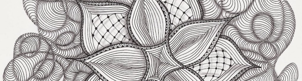
This was so fun!  My final tile looks complicated, and would have been if I hadn't taken it just one step at a time.  Let me take you through it:

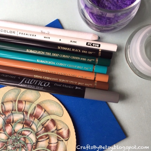
First I drew Molygon in an organic spiral with my black micron on a renaissance Zendala.  I started with the small "orange slices" in the center getting larger as they spiraled out organically.  At first I tried not to let them touch, but midway, that just wasn't working, so I let them stack on top of each other in Hollibaugh fashion.  

Adding some color:  Because I envisioned drawing a spiraling Marasu over Molygon, I thought some color added between The Molygon slices would help me to differentiate between the 2 tangles. Turns out, this step helped tremendously later.  I used a Tombow marker and my waterbrush so I could feather out the color for a subtle blend.  I scribbled color on my laminated cardstock.  (You could use a blending palette, craft mat, a piece of plastic or acetate.) And picked it up with the waterbrush. Laying it down with less water in the center, more water toward the edge of the tile.  

The next step is patience.  You MUST let the tile dry before moving forward.  I let mine sit for a couple hours, although you could dry it with a hair dryer or craft heat gun.

The next step was was a little scary.  I took my brown micron and drew a spiral over the Molygon.  Just totally ignoring the Molygon.  I thought about using a pencil string, but in the end I just went for it with my micron.  

Then I used that brown micron to draw in the larger stripes of Marasu by wrapping the stripes around my spiral lines, working outward from the center.  I only drew on the Mollygon slices.  I skipped over any of the blue green.  I think this might have gotten confusing quickly if I didn't have that color wash down.  With it, it was easy to skip over the blue green areas.  

Next I added narrower black lines.  It was easier this time to work from the outer edge toward the center.  I wasn't quite sure how to end the stripes, and thought I might return to the outer edge later, but in the end, I liked it that way.  

More color:  Next I added shading by adding the darker brown Polychromos color to the lower edge of the brown spiral line, again trying to only add it to the Molygon and skipping over the blue.  I blended this color with a blending stump and odorless paint thinner.  I added a lighter brown on the other side of the spiral line.

Then Molygon was pretty hard to see so I added the blue greens around the edges of Molygon and blended.  

The Renaissance tiles look fabulous with white.  One problem I have with the Generals white charcoal is that I can't really add layers on top of it.  Because I thought I might need some more layers, I used my white Prismacolor.  I'm a fan of the Polychromos, except I must admit that I like the white in Prismacolor as it shows up better.  So my next step is adding white in the spiral of Marasu.  I used a dry tortillion to blend it somewhat.  

I felt the Marasu needed to pop more, so I added black to the spiral edge.  
Marasu/Molygon duotangle

I liked that, but felt it needed more, so I added the gray Fabrico Marker too.

During all of these steps, you're just focusing on one step, not the overall picture.  When I took the time to take it all in, it was so cool to get lost in the 3D effect spiraling in and out.  

One last note, I try to indicate my inspirations whenever I recognize them.  Sometimes it's hard to remember just where I saw something, or to notice that I've been influenced by ....(colors, moods, people, TV, YouTube, magazines, etc etc). There is so much that affects me at least subconsciously.  This time, I knew my overlaying the tangles wasn't an idea I came up with, just an idea I wanted to try.  I thought it was Margaret Bremner who had inspired me, quite a while ago.  I looked back through her blog, and sure enough there it was...here's her post on overlaying tangles.  

So this piece was my response to the Diva AND my first day of coloring for the color challenge.  I hope to post some more coloring examples soon, I have some new stamps that are calling out for color... ;-)

Thanks for your comments!  Have a great day!