Friday, June 26, 2015

Still playing with black tiles

The Divas challenge #223 and recent Zentangle® newsletter both challenged me to take on umble again. I thought I'd try it on black, though there was no need to play with line width (more on that in a bit) as it has both thick & thin line width in the original pattern. I did use "redefining the line" to go back and use my black micron to add a black edge to emphasize the Hollibaugh effect of the tangle. This made a big difference! I also noticed the black Zentangle ATC is a much deeper black than the Artagain paper I used below. In addition to the ATC and Pigma micron most of this is done with the Sakura white Gelly Roll and a touch of Zenstone.

I was so excited after sending a link to my last week's post to Maria (yes THE Maria) and getting a reply that she'd like to reference my work when they came to black tiles at seminar! I was stoked! I had started a couple more "tiles" playing with line width and went to finish them right away, hoping to provide ample examples. I love the Raddox, but the top one is just as informative. While there are aspects of it that I love, it taught me that like shading, you can go too far with line width. It's the contrast that makes it work. If you missed last week's post, you can check it out here.


I also wanted to get some color on the black. This is approximately an 6.5 inch by 7.25 inch piece of Strathmore Artagain paper that was scored to become a slider pen box for more of my pens. I used both Sakura Stardust and Metallic in addition to the white Gelly Roll.


And I also worked on a more traditional black tile. (Gelly Roll, Zenstone, Fabrico gray and black Pigma micron.) I always learn so much preparing for a new class!


Friday, June 19, 2015

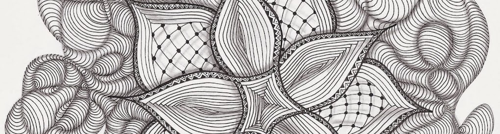
The line redefined, white on black.

It started with me not being satisfied with my white on black tiles. For awhile, I couldn't really put my finger on why. When I drew this Meer, I thought I'd try using line width to emphasize my highlight. Whoa! That I liked. So I looked at that and I looked at my other black tiles. You know, the appreciation step.... But this time I was trying to see why I liked this so much more. I realized that on my earlier attempts I was using the white pen just like I did the black, usually to draw the outline of a shape or pattern. Where the black worked because the edge of a shape typically drops towards the background, the white brought it forward. And I was using the white for both highlights and shading and sometimes black was my highlight (for instance making the pen skip for a typical sparkle). All this back and forth really confuses the eye. When I expanded the white by redefining and broadening the line, that highlight was pleasing to my eye. And even though I also mainly use the white for the contrasting shadow, just by line width (a thin line) I could make that work too. This really challenged me to think differently as I was drawing. Definitely focused deliberate lines here. So give it a try. Draw your tangle then redefine and thicken some lines. It's like the black you leave showing is your line, not the white. Consider where to leave contrasting thin lines (kind of like shading, too much or to little doesn't work all that well). The added benefit of the thicker white lines? You can shade on top of the white. I used graphite and occasionally my black micron, but you could also use a gray marker or other colors. Think layer. The downside of all that white? The white gel pens don't seem to last as long as the microns.

This one is my favorite, I love the thin white edge on the right side of Shattuck giving it dimension. I used a Sakura white Gelly Roll, Zenstone, a white CretaColor Aqua monolith pencil and woodless pencil. I also used a black micron to redefine some line edges (for instance around the pearl sides of Meer). Tangles: Meer, Keeko and Shattuck.
This Monotangle of Ambler only uses the black tile and white Gelly Roll. Really, there is no other shading other than line width! I started making them solid white, but the varied line width makes it so much more interesting.
This is two tangles, Static on top with Maryhill filling in below and I used the Gelly Roll and graphite shading plus a little Zenstone around the edge.
A Fife monotangle using Gelly Roll, graphite and (not sure whether I used Zenstone, General's white charcoal or CretaColor white watercolor pencil, or maybe a combination).
Maryhill and Tipple using Gelly Roll, graphite and black micron on a prestrung Zendala.
If you too aren't quite satisfied with your black tiles, give this a try. Even if you are, it's a nice alternative (or could it be a variation? ;-)

Tuesday, June 16, 2015

Stamp, Color, Tangle

This Zentangle® Inspired Art (ZIA) is my contribution to The Diva's Challenge # 222 Colours of the Rainbow! First I used a rubber stamp "#90391 Orchids" by Stamps Happen Inc, Cathy Squire Image Source, inking with Onyx Black Tsukineko VersaFine pigment ink onto a watercolor scrap that was 6 inches square. The stamp is approximately 4 inches square. Here is the image (the black outlines) after I added some watercolor pencil with my CretaColor Aqua Monolith pencils.

Next I added water with a watercolor brush to each section. After it dried, I tangled with an 005 Sakura Pigma Micron in black. I added shading with graphite (I'm loving my CretaColor woodless pencils, they are so creamy smooth) and a touch more color with the watercolor pencils, but left them dry this time. I'm quite happy with my subtle rainbow. Tangles are Shattuck, Betweed, W2, Quandary, Printemps, Avreal, Hibred, Diva Dance, Tipple, Keeko, Hollibaugh and Munchin.

Saturday, June 13, 2015

Friday, June 12, 2015

Friday, June 5, 2015

Renaissance tile class

What a lovely student mosaic. We took our time with these first tiles...


And only started the second.


And beautiful payment envelopes!


(All artwork by students here!)