Friday, July 25, 2014

Truffles

This week's Diva challenge is to use CZT Caroline Broady's tangle "Truffle". I quite enjoyed it. I hope you do too! Check out the other Truffles!


Follow the sun

... for The Weekend in Black and White ...


Maryhill Zendalas

I've had some fun with Maryhill and the pre-strung Zentangle® Zendalas. Both of these used the same pre-strung tile pattern, and in each I chose to add to and ignore some of the string.

For the first tile, I went with smaller segments and my lines were closer together. While I do really like it, it's a little busy. I decided with the second that I would use larger segments and space the lines further apart. I thought I'd share how the second tile evolved.


Friday, July 18, 2014

Partial Bridge Lift

Northbound bridge lift, Columbia River, Interstate Bridge and this weekends entry for The Weekend In Black and White.


Wine anyone?

What a week! Tanglepatterns.com posted my tangle Maryhill! It was very exciting to see it scroll up! And then I had more viewers to my blog in one day than the previous month! People seem to be enjoying it and that's fantastic! Maybe I'll see it in your artwork one day and that will be fabulous! Tanglepatterns was one day, and the next, I'm able to log in as a CZT to the Zentangle® website! I'll be lost in those resources for a while! But before all that....

The (guest) Diva challenge this week is B.Y.O.B. using a favorite beverage in your art or as inspiration. Gotta say, I'm not a big wine fan. My first choice BYOB was Cherry Coke. I drizzled a little on a tile. Got a blob I kinda liked. And waited for it to dry. And waited. Finally I sopped up some up with a paper towel. I tried to dry it with my heat gun. It was a sticky gooey mess. Still tried to tangle Poke Root around it. (Cherries, get it?) ok, too planned, too structured for the Zentangle method, at least for me. But I kept going anyway. Even tho I was trying to go around the sticky mess, I managed to get some in my pen nib. Should have gone with tea, no sugar! Lets try again....

So does drinking the Cherry Coke while I made my friend's birthday card count? Her favorite color is burgundy. Wine may be pretty close to the top for her beverage of choice too. I used the same 3D die technique as last week's dragonfly. This is also a Spellbinders die. Sorry, no actual wine here. I used Copic Multiliner in Wine for the ink color. Shading is with Faber-Castell Polychromos and graphite pencil. The black ink a Sakura Pigma Micron. After completing the tangle, I mounted it on burgundy cardstock (shaded with copics to try and match the color) and then mounted on an A2 card base. The nice thing is it will lie flat for mailing and the wings easily pop out for the 3D effect.

Here is another no tangle card using the same technique. Dies by Spellbinders (gears) and Sizzix Hero Arts (caption rectangle). I used a Cuttlebug embossing folder as a stamp and inked with a Big and Juicy rainbow pad before using additional die cut gears as masks or stencils and used copic markers with an airbrush. Best of all, I used my P-touch label maker for the sentiment....why hadn't I thought of that before?

And finally, just wanted to share this Auraknot, Organza Again drawing from my art journal.


Friday, July 11, 2014

More Crux (not horcrux)

So I kept at it. Two more examples of Crux. See today's earlier post for the first batch.

I also wanted to try Crux as a background for a card. The dragonfly was cut using a Spellbinders die. I used this technique I found on You Tube. I think I'll be trying more of my dies with that technique. I used Yasutomo Pearlescent Watercolors for color on both the tangle and dragonfly.


Follow me...

This week's entry for The Weekend in Black and White...


Crux

The Diva's challenge this week, #175 was to use the tangle Crux by Henrike Bratz. This was a new tangle to me so I tried a couple of different versions first before getting into my "tile". This tangle has lots of variation possibilities, some because I just put the line in the wrong place!

You can probably tell that I like Maria's style of "tucking" her tiles into the paper.... I just LOVED being able to look through her art journals at CZT!

For my tile, I decided to use a pencil grid. I really like how it turned out. Now I'm wondering, did I even need that grid at all? Might have to go play some more!


Saturday, July 5, 2014

The cover of my mini-book for Zentangle® tiles

If you saw my post yesterday, you know I'm working on mini-books to hold either ATC cards, or Zentangle tiles. I incorporated this week's Diva Challenge #174, superimposing strings, to adorn the cover of my newest Zentangle tile mini-book. The finished book is 4" x 4" and is made from Strathmore Art Paper. Mine came in a pad of 12" x 18" assorted colors. I cut a sheet of blue down to 11" x 16". It was a little difficult to fold, and the paper is heavy enough that it doesn't want to stay closed, but I'm working on a closure for it. The blue looks awesome, doesn't it? I think storing completed tiles with blue accents including the renaissance tiles, will be an ideal choice. For more on how to make these mini-books, check out this post.
My superimposed string resembles a framed basketball with the mark of Zorro!
In addition to the string in pencil, I used Sakura Microns in both blue and black. Shading and highlighting was done with Faber-Castell Polychromos Prussian Blue and General's Charcoal White.

Friday, July 4, 2014

Mini book for ATCs can also be modified for Zentangle® tiles

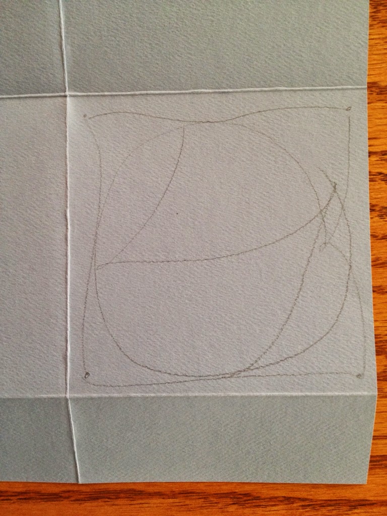
I made this little pocket book years ago before I knew anything about Artist Trading Cards (ATCs). It is the perfect size for them at 3" x 4" and an easy project as it only uses one sheet of 12" x 12" paper. The trick is finding the right paper. My first book is made from a wonderful sheet of lightweight yet sturdy paper that is almost fabric like. It feels like a suede on one side and more like paper on the other. Once I found Zentangle, it has held up well carrying either ATCs or my tangle instruction cards. There are 8 pockets so it can carry a nice variety of cards.
I took this mini book to my CZT seminar along with its modified version to hold tiles. I thought I'd share the "how to" information with you today. I even found the link to the YouTube I used initially here!
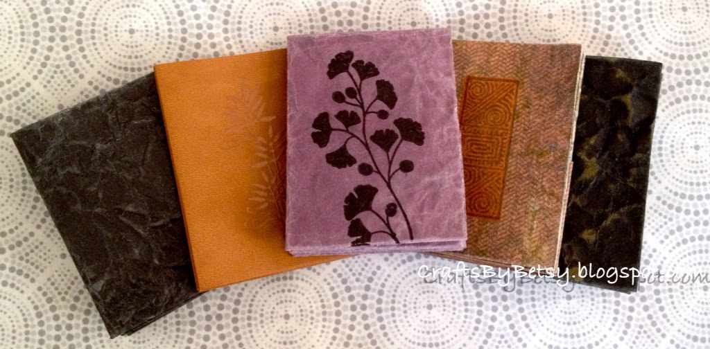
I went in search of some similar paper to what my original book was made from. Easier said than done. You need 12x12 double sided paper but I just wasn't finding that durable fabric quality. As I pondered this problem, I thought maybe I could make the solution from the faux leather technique! Here's the link to my earlier post about the faux leather. So I simply used typical scrapbooking cardstock for the faux leather and here are the results. I would suggest NOT using a white core paper as you will likely have some white, worn areas showing after going through this technique. My faux leather mini books are about three times thicker than my original, (faux leather book is approximately the thickness of half a deck of cards) but seem to be very sturdy. I simply inked and sealed both sides instead of adding fabric to one side. I'm very happy with them but am still on the look out for the perfect paper.
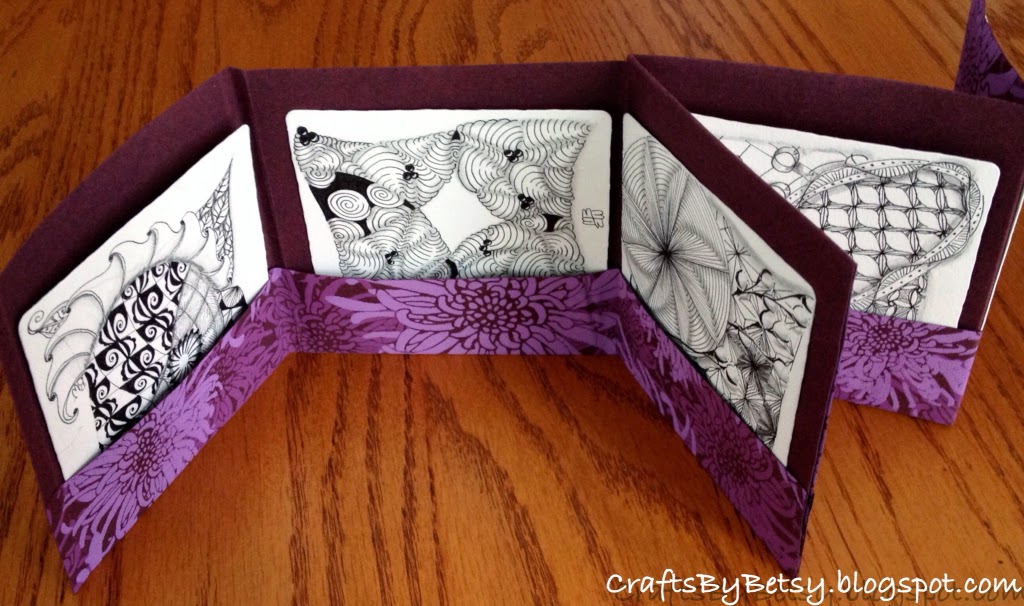
To make the mini book for the 3.5 x 3.5" tiles (the book is 4" x 4") modify the instructions to use a 16" x 11" piece of paper. This example is cut from a double sided poster sized specialty paper found at an art supply store. I modified the original instructions so that the pockets are only 1.5" deep.
The stamped image on the front of my original mini book (tan) is from Paper Parachute and was heat embossed. I'd like to give credit to the smaller stamp image on the pockets as well, but I just can't locate the stamp (could I have a lost stamp? Oh my!) If anyone knows the company, please let me know so I can give appropriate credit. The stamped images on the faux leather are from Stampin Up! using Stazon ink. I felt only two were smooth enough to stamp on after the faux leather technique.